
Creating this style guide was number one on my to-do list for the community centre. In part because I didn't have one when I joined the team, and also because I had a large hand in creating the branding for the centre. It was important to me that everything created under the umbrella of our brand, whether or not I had a hand in it, should adhere to our overall aesthetic. This is the most recent iteration of the guide.
The intro reads:
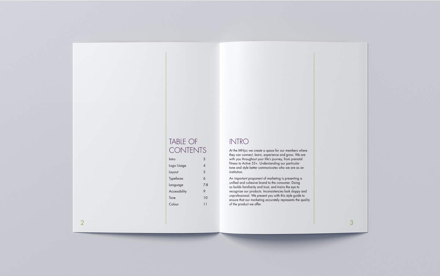
At the MNjcc we create a space for our members where they can connect, learn, experience and grow. We are with you throughout your life’s journey, from prenatal fitness to Active 55+. Understanding our particular tone and style better communicates who we are as an institution.
An important proponent of marketing is presenting a unified and cohesive brand to the consumer. Doing
so builds familiarity and trust, and trains the eye to recognize our products. Inconsistencies look sloppy and unprofessional. We present you with this style guide to ensure that our marketing accurately represents the quality of the product we offer.
so builds familiarity and trust, and trains the eye to recognize our products. Inconsistencies look sloppy and unprofessional. We present you with this style guide to ensure that our marketing accurately represents the quality of the product we offer.
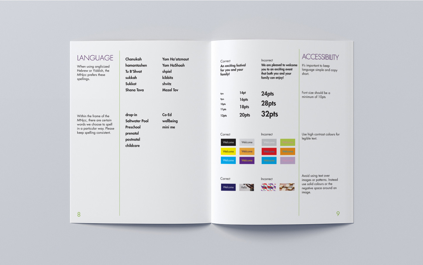
At the MNjcc we pride ourselves in being leaders in Access and Inclusion, and that includes adhering to AODA design standards.
