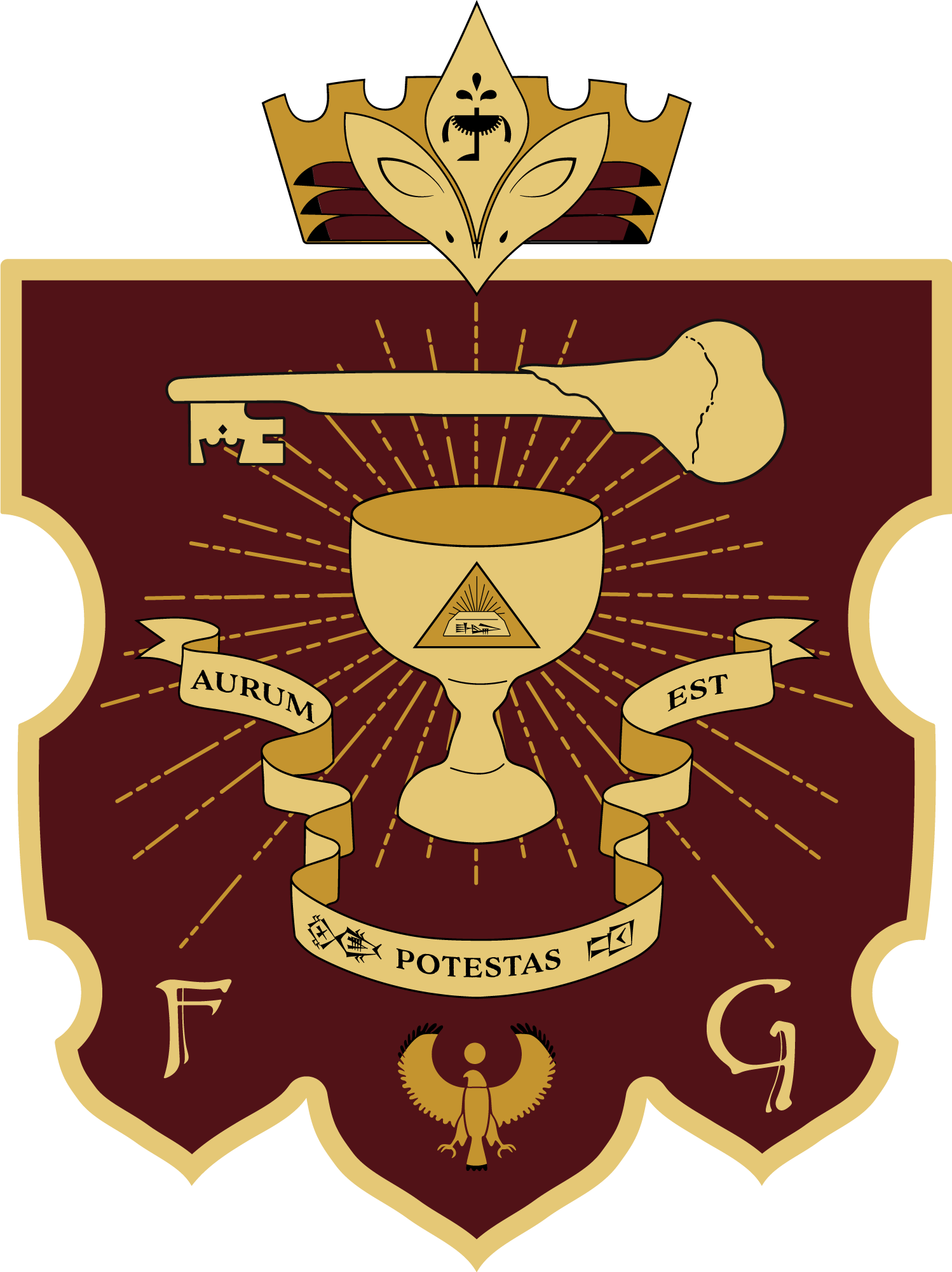
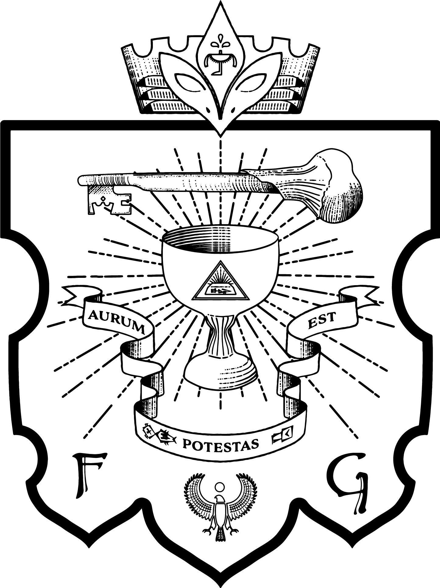
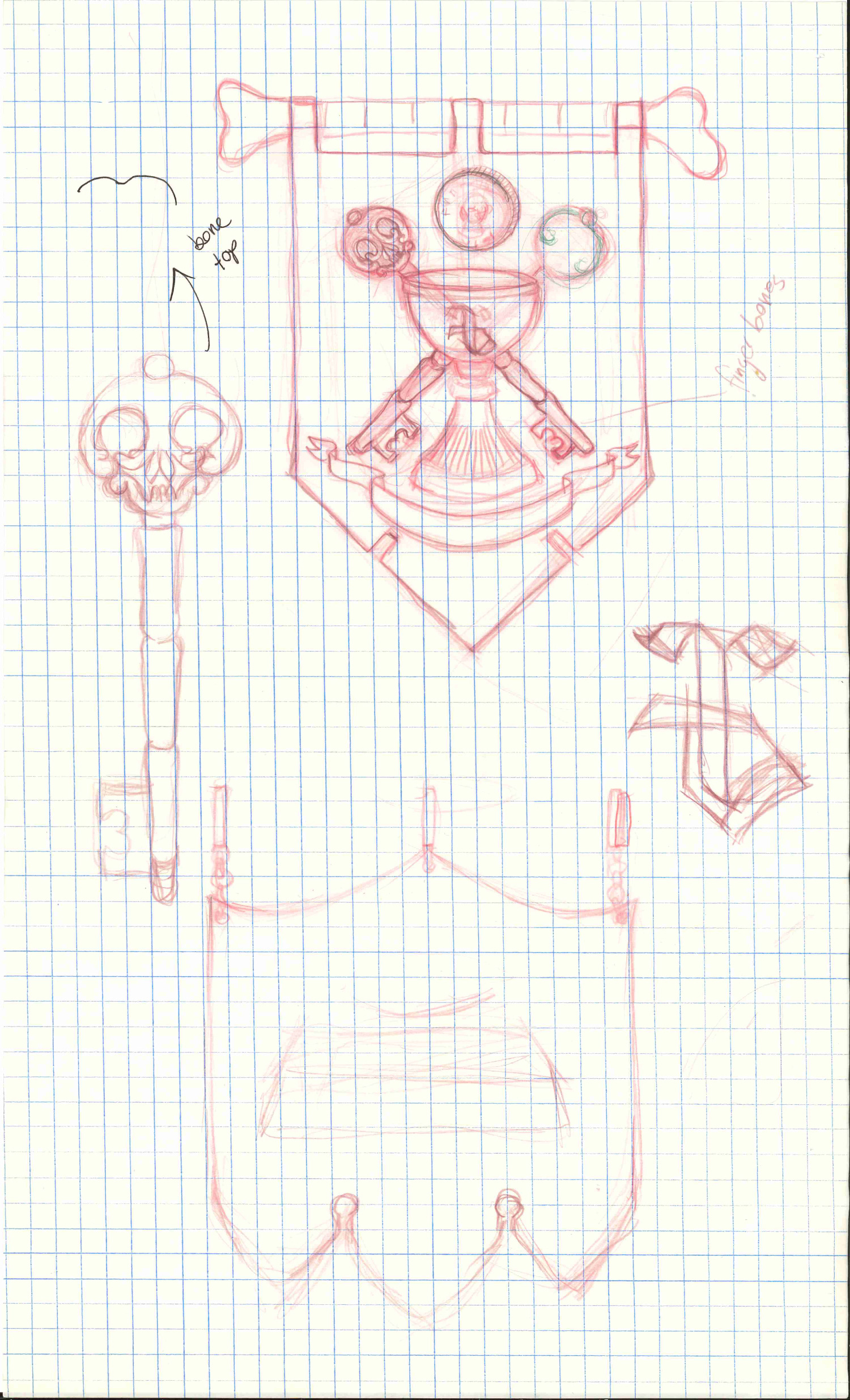
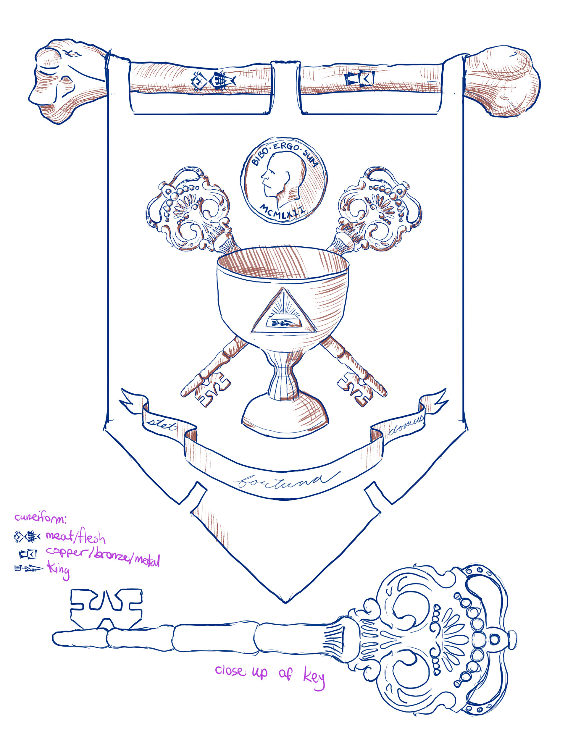
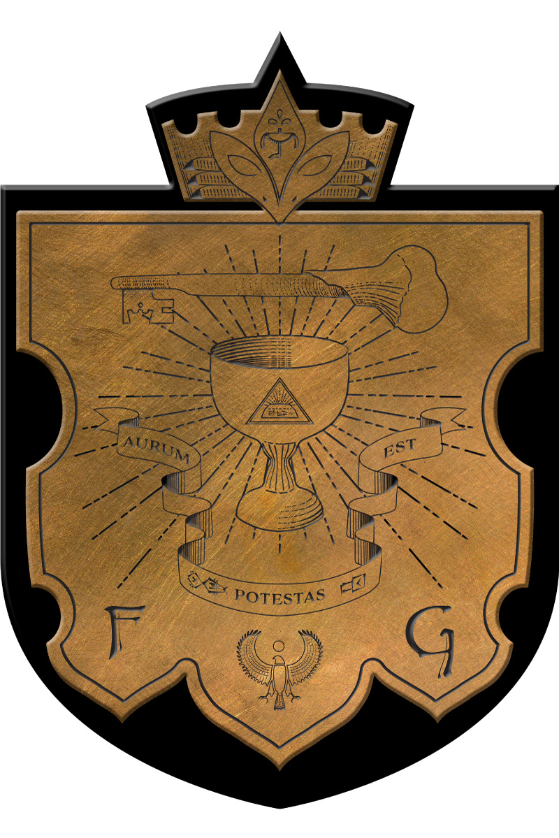
A central part of the plot of Overcompensating revolves around a secret society on campus known as Flesh & Bone. It was my responsibility to design the emblem that would be at the centre of the branding for the organization. Our designer had a vision for certain elements she wanted to see represented - a bone key, a hawk or falcon, and a very obvious reverence for wealth.
My starting point was researching other university/college secret societies and gathering references of their emblems and sigils. Then I started making some rough pencil sketches so we could start zeroing in on what the designer was looking for.
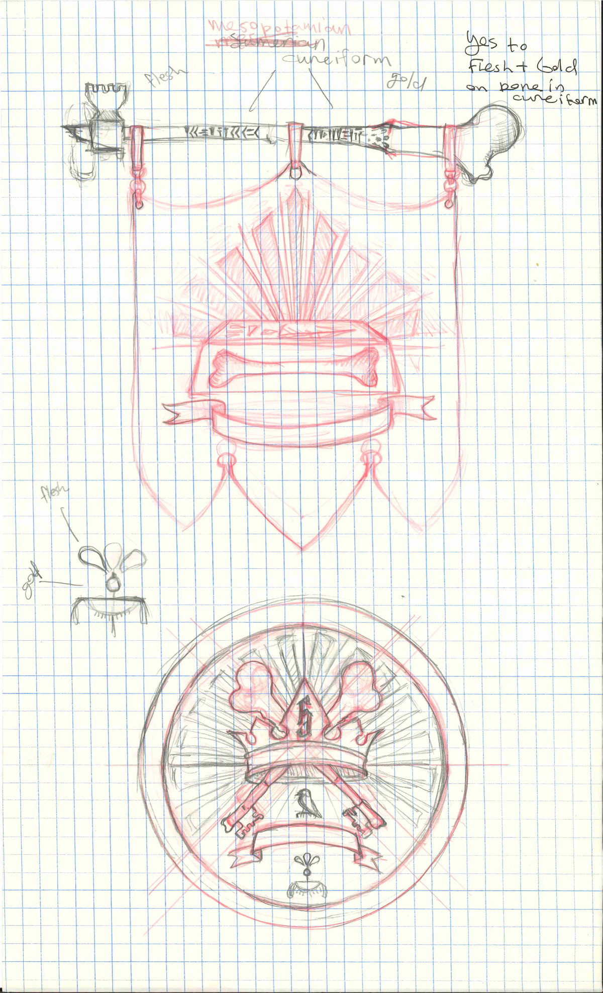
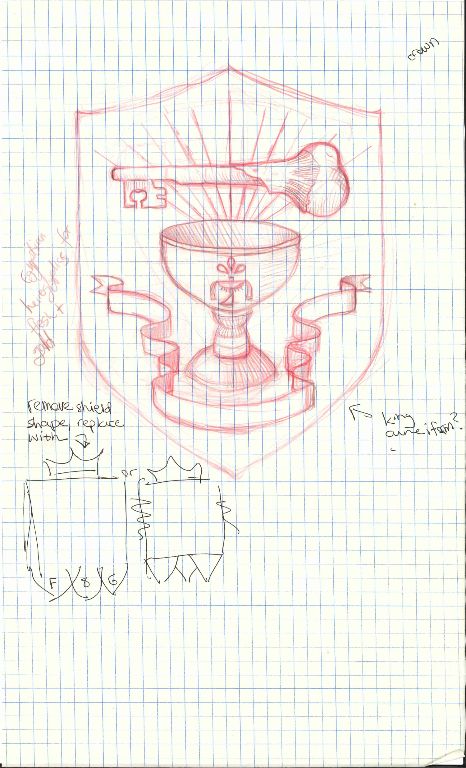
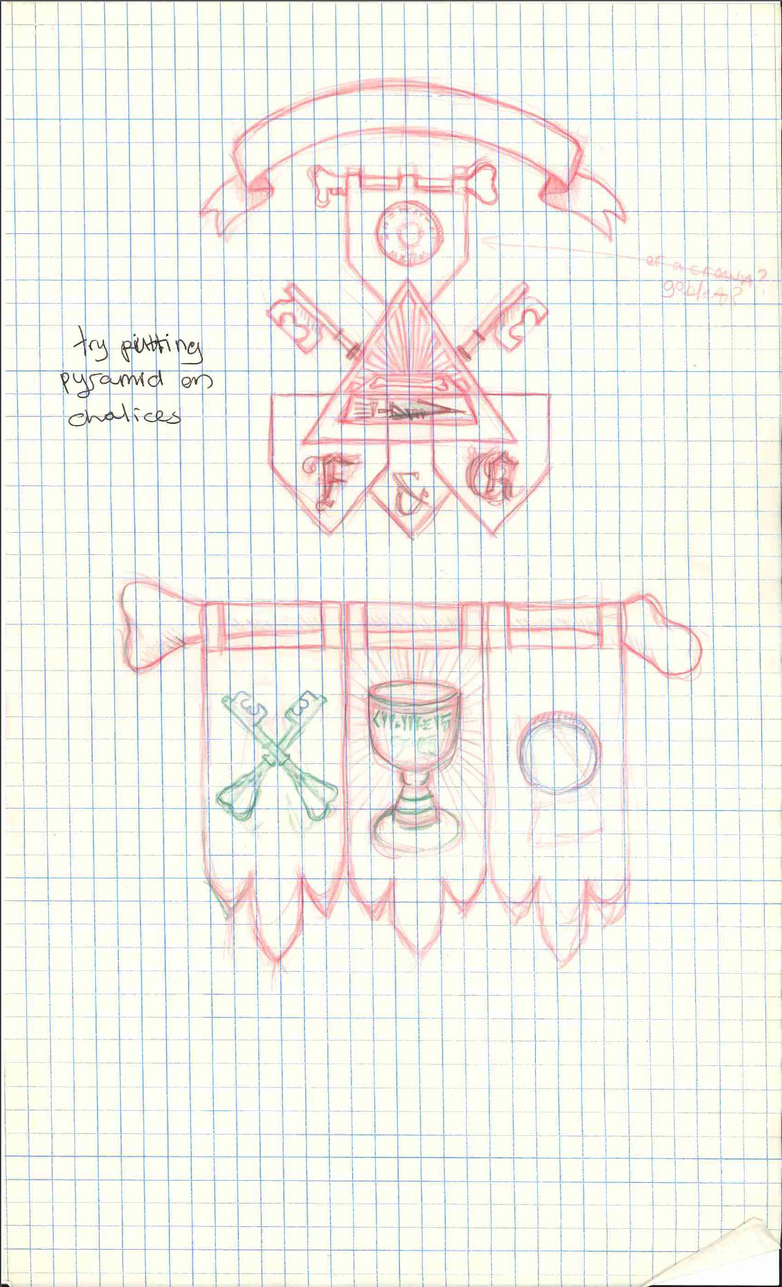
From there I moved to creating the next batch of sketches digitally, which would allow me to copy elements we liked from one option to the next. I researched hieroglyphics and various cuneiform alphabets. The final version includes on the crown a combination of the hieroglyphics for "flesh" and "gold", on the banner are the Hittite cuneiform symbols for "metal" and "meat/flesh", and on the gold bar pictured on the chalice is the cuneiform for "king". I also researched Latin mottos and proposed a list of options. Ultimately they selected aurum potestas est, which translates to "gold is power".
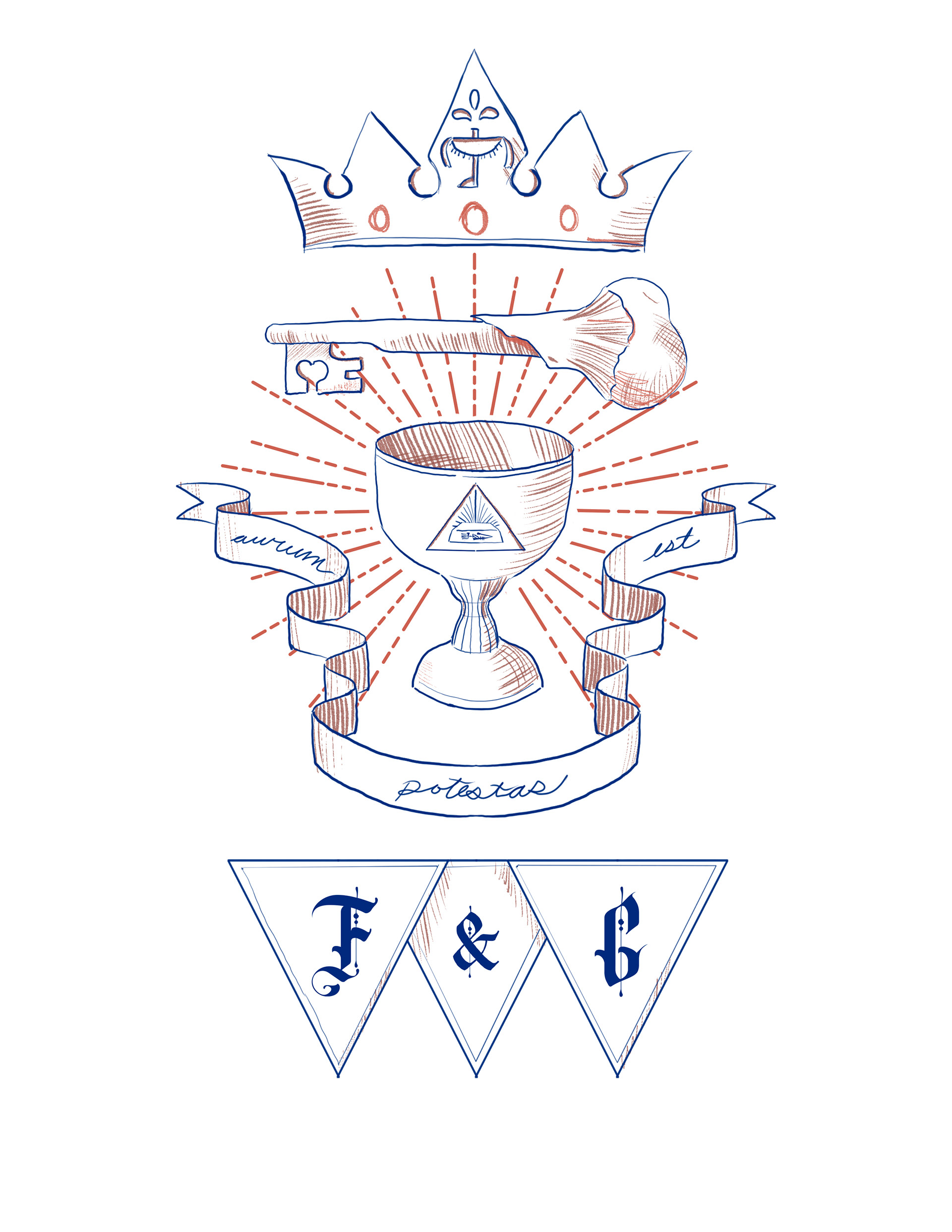
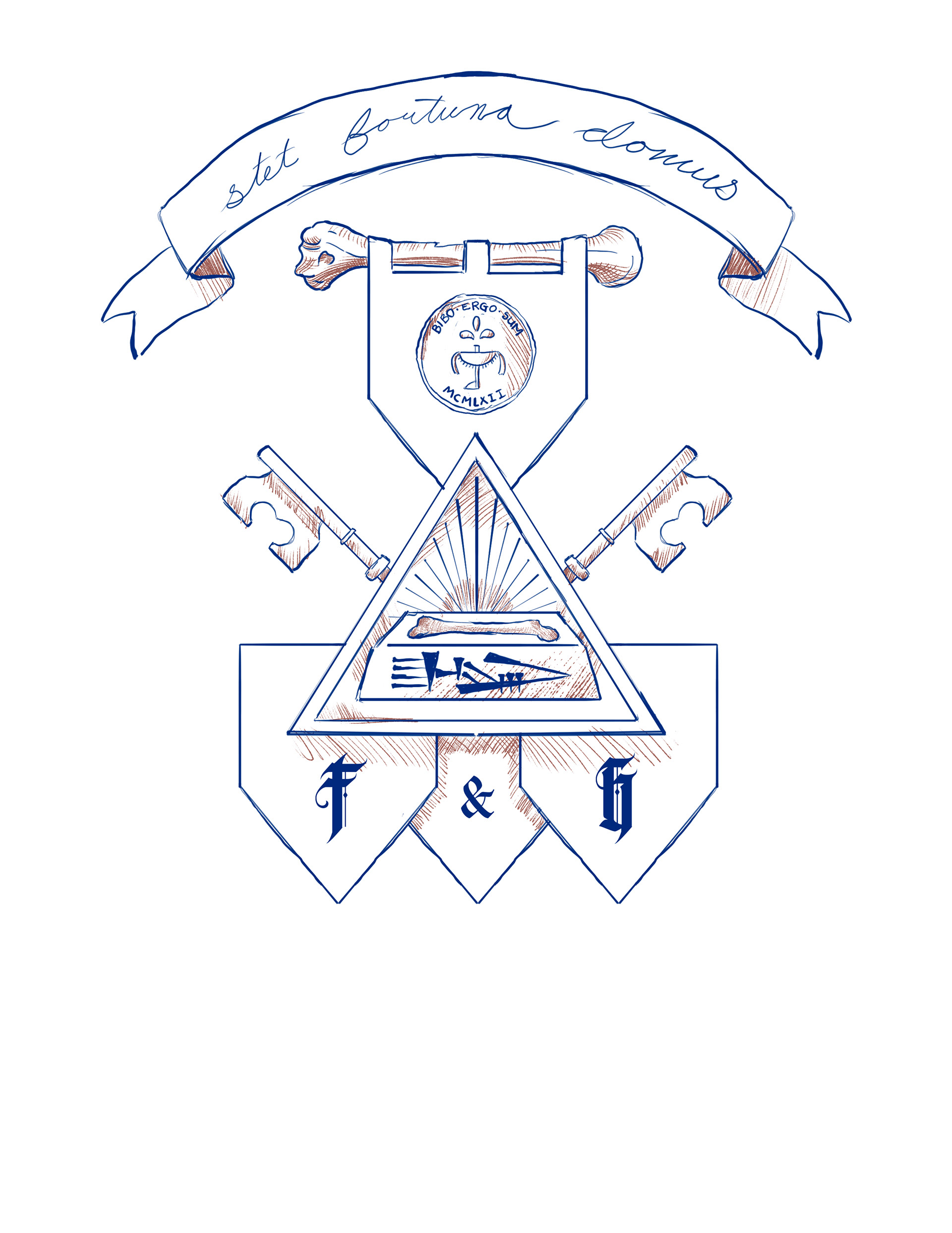
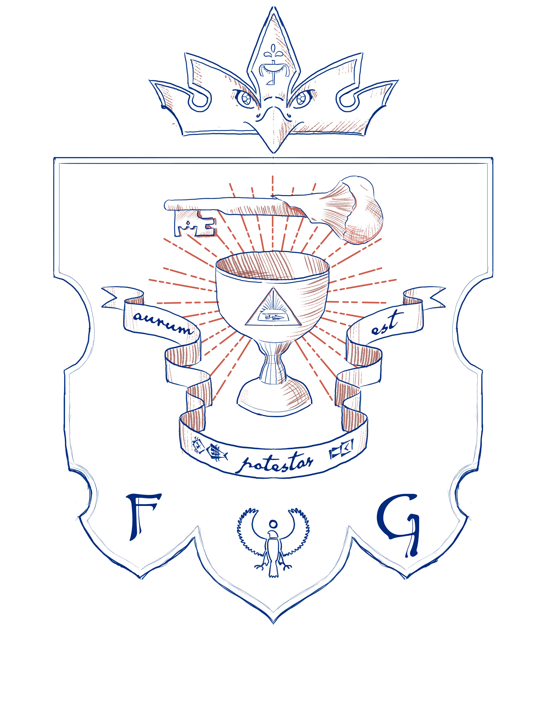
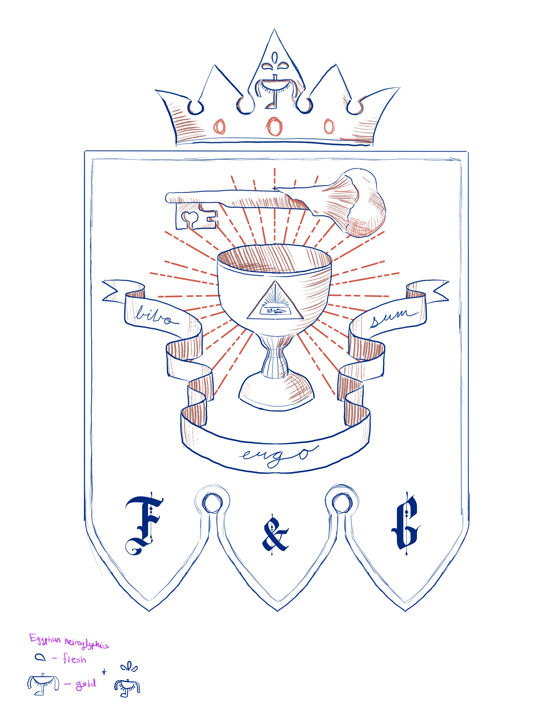
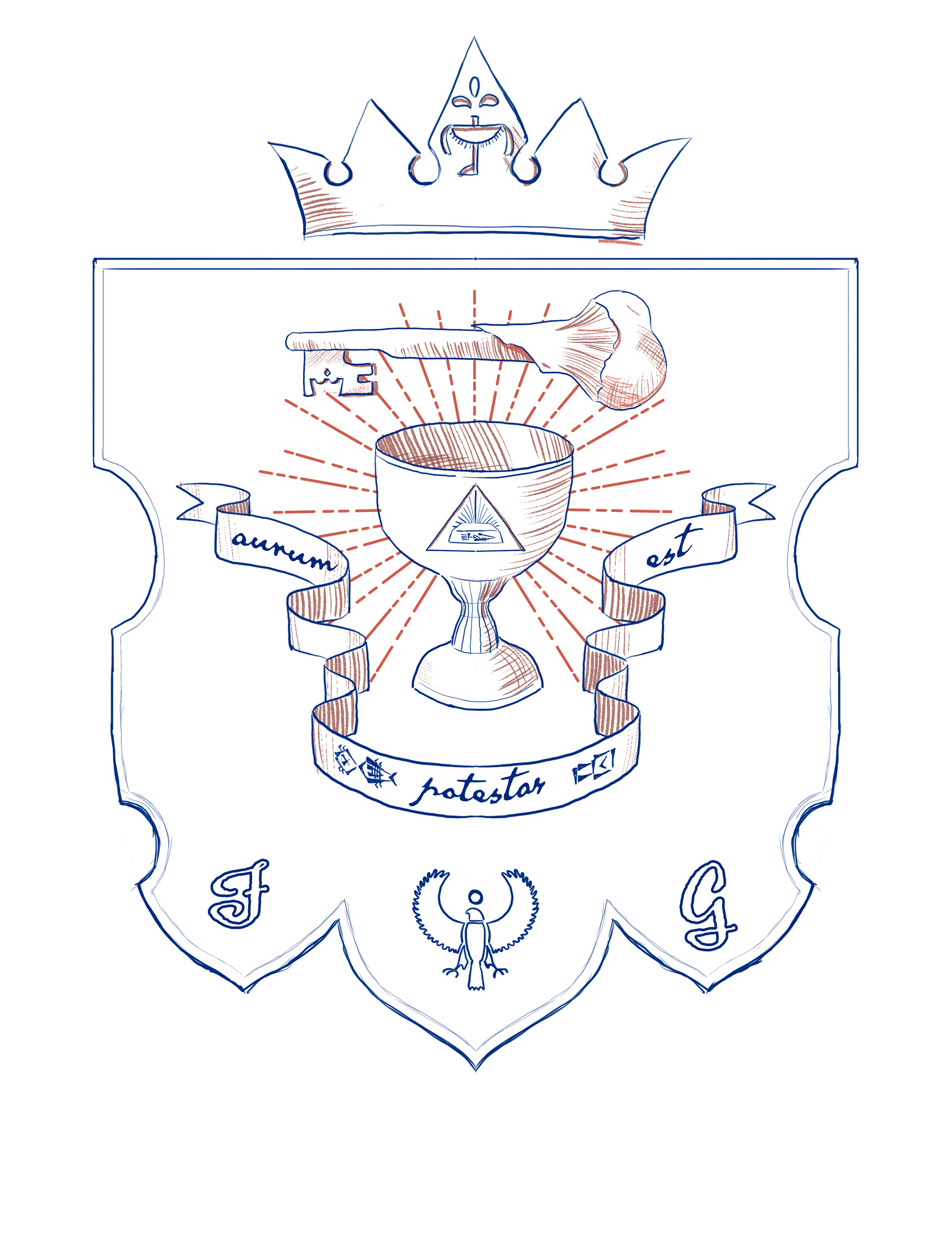
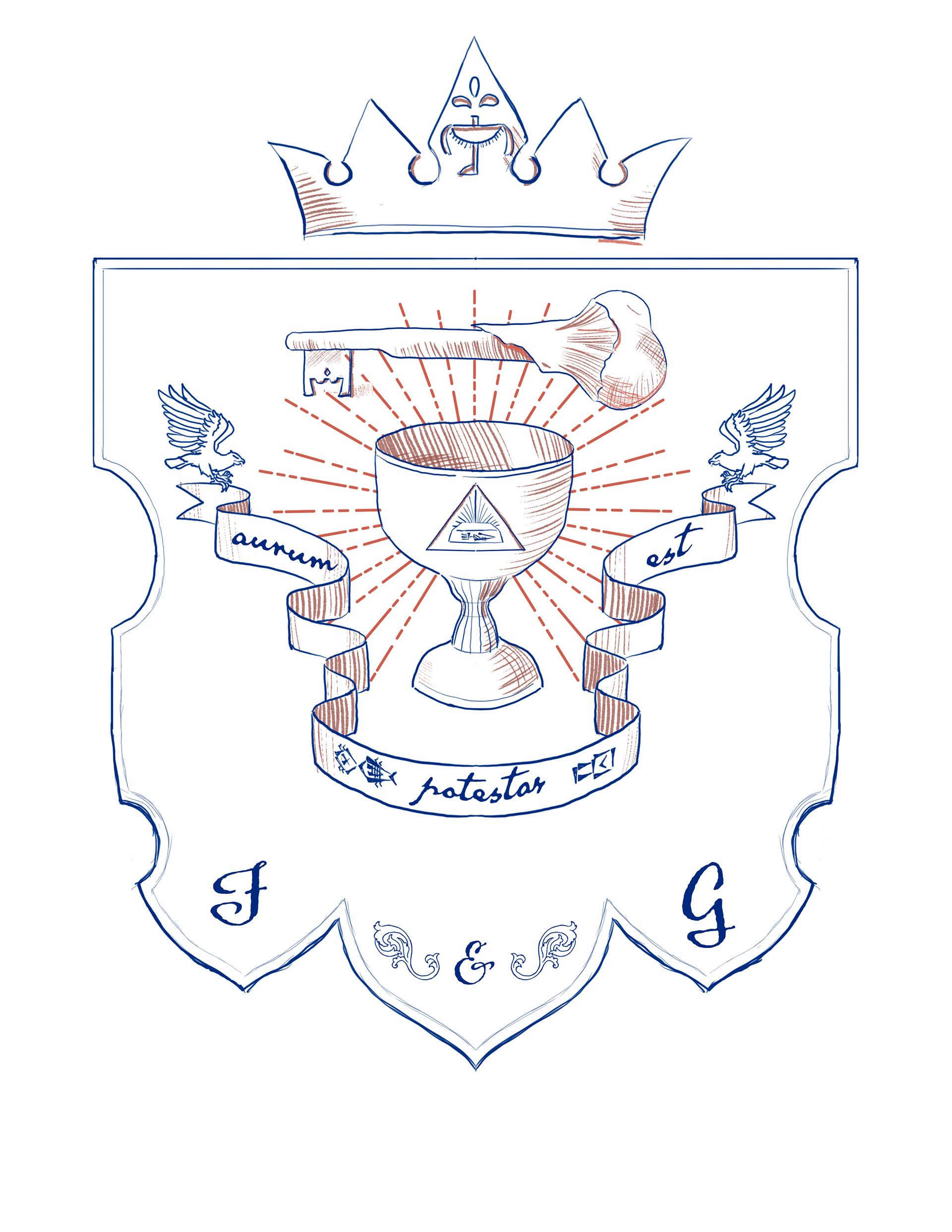
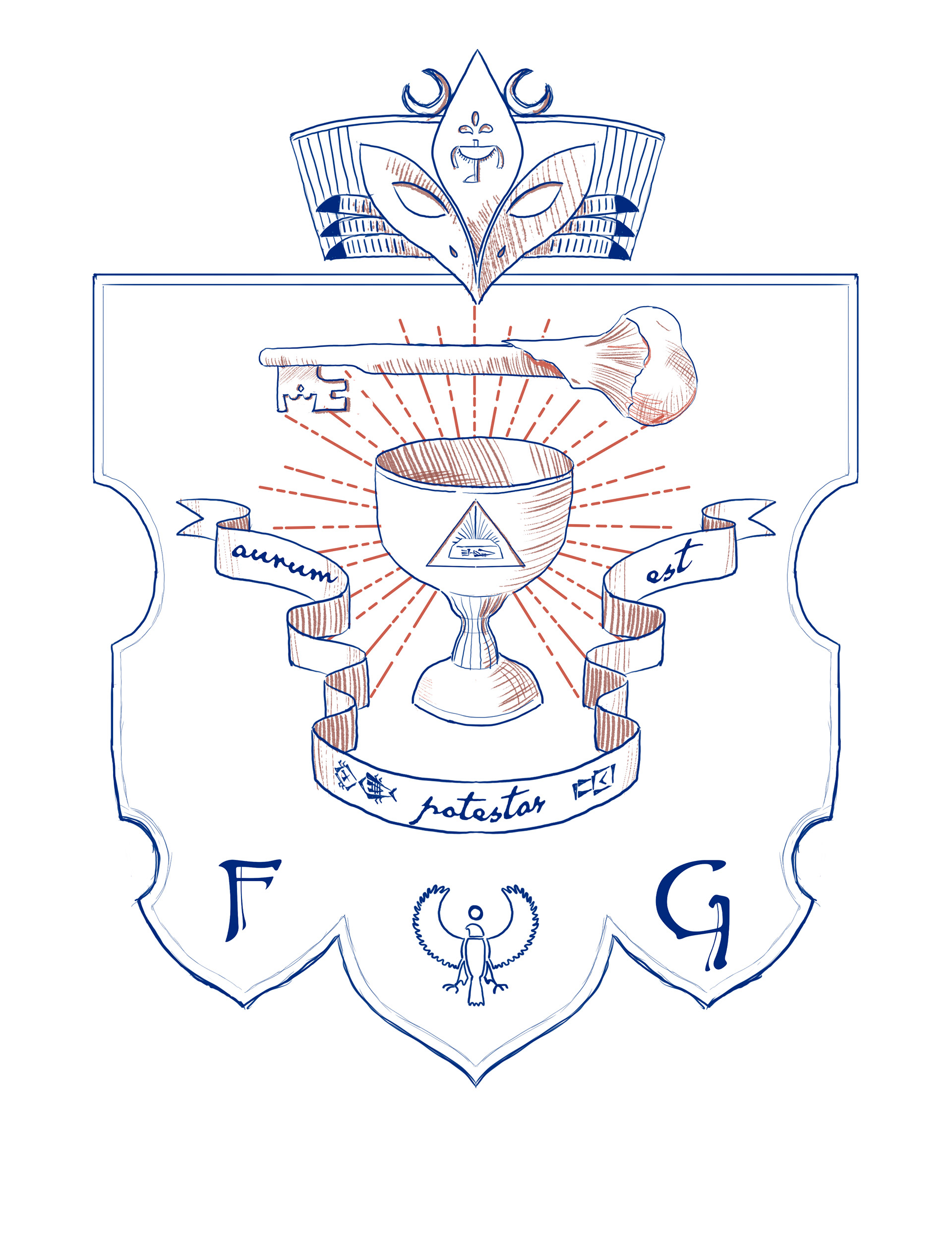
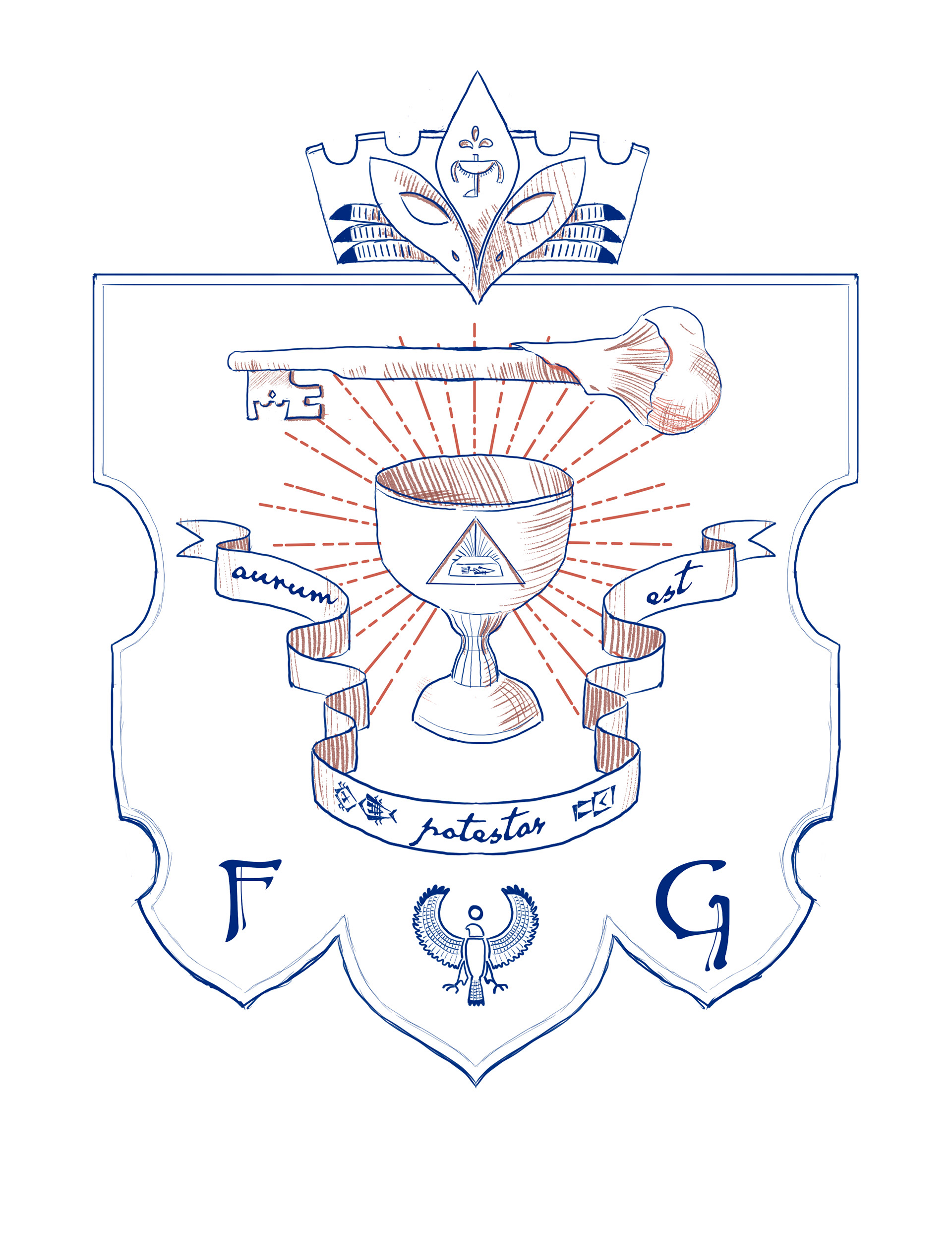
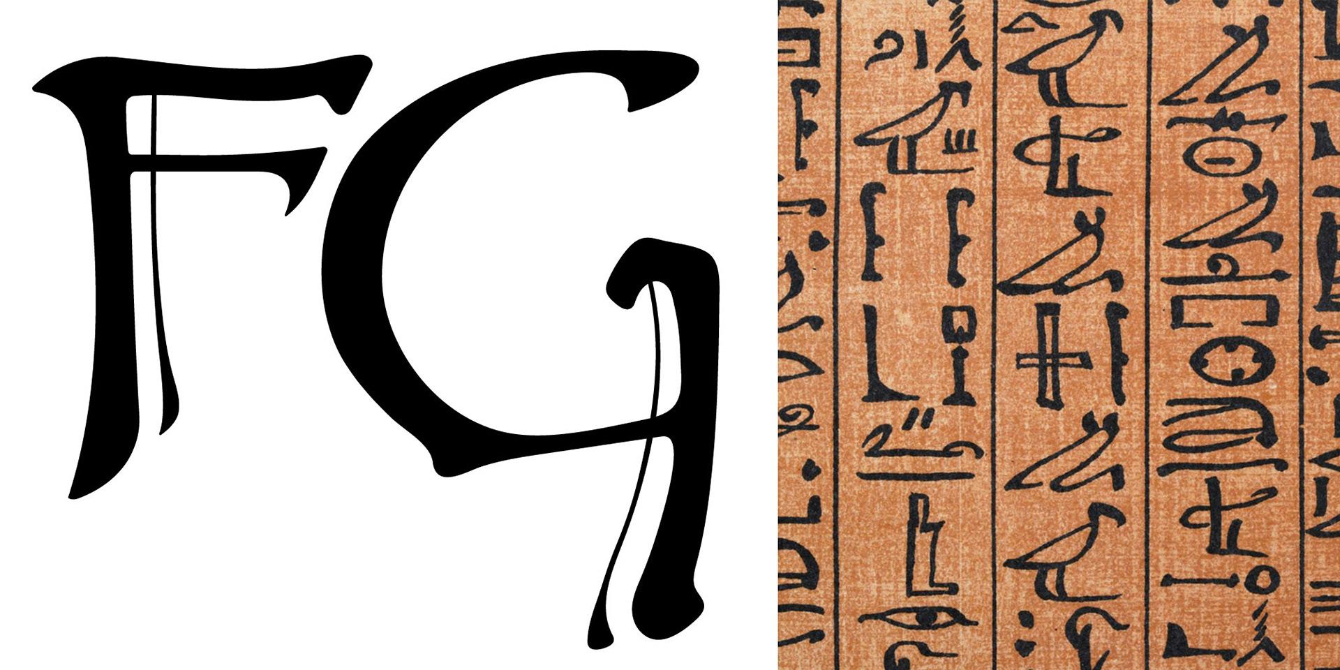
For the F&G initials that appear at the bottom of the emblem, I initially tried a few different typeface options, but ultimately ended up hand-drawing the letters, which were inspired both by the typeface Papyrus, and the research I'd done into hieroglyphics.
Bronze plaque mockup

Tie pin mockup